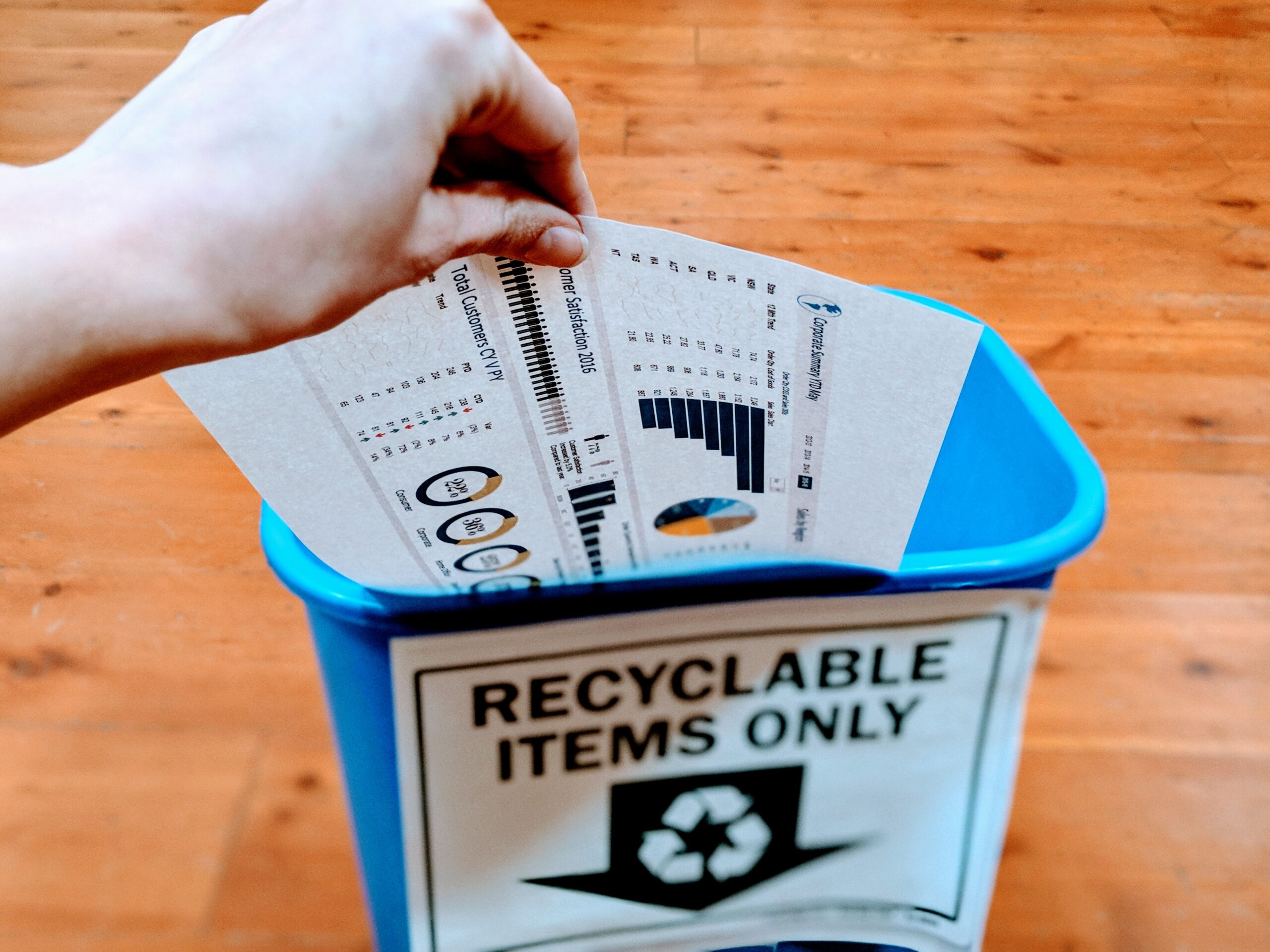
How To Make Your Data Dashboard Actionable, Not Recyclable
 You pull over, check the pressure in all four tires and find they’re all ok and still, there’s that darn symbol. Ahh, you remember the spare. That must be the problem. So it was definitely not an emergency, and checking the spare was the last thing on your mind.
A more effective car dashboard might have a diagram of your tires that lights up to tell you which one is low; it might even have a red/yellow indicator to show whether it’s a slow leak, a severely low tire or a puncture, losing air fast.
The data that should be on your dashboard
What should be on your data dashboard? You don’t need massive amounts of data on a dashboard, just the data related to your company or organization’s Key Performance Indicators (KPIs). These are things like donations, purchases, memberships, etc. The KPIs should align with the objectives of your organization. There are likely to be only a few of these. Along with these few data points, you should include text. This is where you talk about what all that other data that you’re not putting on the dashboard tells you. You’ll use a few sentences here to explain the “why” and the “what” behind the numbers. Why are the KPI numbers the way they are? Are they up because of a campaign or down because of a drop in your search rankings? Maybe there are multiple factors at play, but it should still be condensable into a few sentences.Going beyond data to add value to your dashboards
Once you’ve mapped out those KPIs, then what? Here are another few sentences where you can really add value. Imagine if your car piped up and said, “pull over – your tire is punctured,” or “when possible, add 5 psi to your spare.” That would be much more useful than showing a low-pressure symbol. Similarly, telling the person looking at the dashboard what actions should be taken, beyond recycling the paper it’s printed on, will add value. For example, purchases are up because of a new campaign so there should be more investment in that campaign. You can see in this chart why stopping at the first step, with just a piece of data, could lead to inaction or the wrong action without the extra insights related to why it’s happening and what should be done.| Scenario 1 | Scenario 2 | |
| KPI | Donations are up. | Donations are up. |
| Why | Our Facebook lookalike campaign is driving people to donate. | While we are running a Facebook campaign, the real driver is referrals from the board. |
| What | Put more money into the version of the campaign converting the most donors. | Coach the board to keep up the good work and modify or shift effort away from the campaign. |
The three things your new data dashboard should have
Again, to summarize, the most effective dashboard will have three things.- Data related to your organization’s top KPIs
- A sentence or two about why the data looks the way it does
- A sentence or two about what to do next


