Best Movie Poster Designs of 2017
The 2018 Oscar nominees are out and awards season is in full gear. I’ve been going to the theater and hitting Netflix and Amazon hard to make sure I catch all the nominated movies before the Oscars air on March 4th. Yes, Gary Oldman is fantastic in The Darkest Hour. Coco made me cry more than any Pixar movie since Up. The Shape of Water was beautiful and weird and wonderful.
During awards season, we discuss our favorite performances, soundtracks and stories, but we rarely bring up our favorite movie posters from the past year’s films. Below, I’ve broken down my picks for the best movie posters of 2017:
The Shape of Water
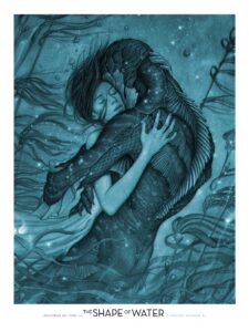
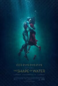
The Shape of Water has, not one, but two gorgeous posters. The first is illustrated by one of my favorite artists, James Jean. He had a busy year, lending his polished style to posters for Blade Runner 2049 and Mother, as well. The second is taken almost directly from one of the last frames of the film. Both beautifully capture the charming, wondrous world Guillermo del Toro created.
Get Out
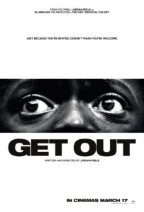
Get Out was one of my favorite films of the year, and this simple poster uses contrast to emphasize the primary theme. If you could only tell the story with one image, this shot of Daniel Kaluuya’s eyes would definitely be it.
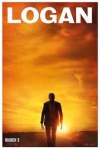
Logan
Like Get Out, the Logan poster is great because of its simplicity. It looks more like a Johnny Cash album cover than a superhero movie poster, which fits perfectly for Logan.
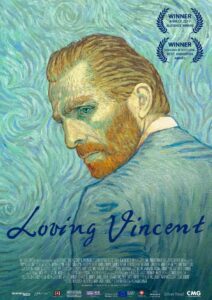
Loving Vincent
Loving Vincent was meticulously crafted using oil paintings in Vincent van Gogh’s style. The poster is a beautiful tribute to van Gogh and the artists who worked in his style to create a one-of-a-kind film.
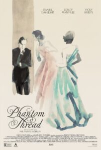
Phantom Thread
This design comes from a series of alternate posters for Phantom Thread by Midnight Marauder and Tony Stella that are painted in the style of a fashion illustration. The lavish script font matches perfectly with the high fashion vibe.
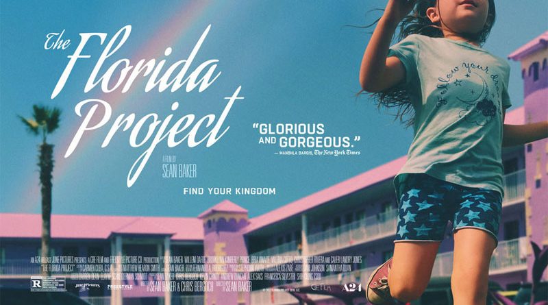
The Florida Project
I loved The Florida Project. I was blown away by all the actors, but especially Brooklynn Prince, who played Moonee, the central character. The muted pastels and retro font capture the essence of the film’s backdrop, a dingy motel near Disney World. The cropping of Moonee’s face emphasizes that the issues highlighted in the film aren’t unique to her. The cropping also offers hope that she might be able to escape her world.
 These posters do a great job of conveying the essence of the films they represent. Their different graphic styles articulate the breadth of tone and subject matter in this year’s Oscar nominees.
At
CenterTable, we provide
graphic design support to clients across different industries, so being flexible in style and approach is important. It’s always inspiring to see how other designers tell a visual story that fits perfectly with the organization – or in this case the movie – they’re representing.


 These posters do a great job of conveying the essence of the films they represent. Their different graphic styles articulate the breadth of tone and subject matter in this year’s Oscar nominees.
At CenterTable, we provide graphic design support to clients across different industries, so being flexible in style and approach is important. It’s always inspiring to see how other designers tell a visual story that fits perfectly with the organization – or in this case the movie – they’re representing.


