Best and Worst NBA Rebrands of 2015
A new NBA season brings with it a slew of new beginnings: fresh expectations for your favorite team, players switching rosters and, occasionally, rebranding.
Teams don’t change up their looks very often, so when they do, it’s easy to notice, and even easier to draw criticism. Fans have a tendency to get more attached to their favorite team’s look and feel than the players since the former usually sticks around for a lot longer. One of my favorite Nuggets jerseys, for example, is a rainbow skyline Carmelo Anthony jersey. Melo’s been gone for almost five years now, but I still love the jersey because of the iconic rainbow skyline. Players change, but design sticks around.
Though many teams tweak uniforms or logos a bit year to year, more teams than usual decided on a full-on rebrand in 2015. Specifically, the Bucks, Hawks, Raptors and Clippers all made extensive changes to their overall aesthetic. Each team took a different approach with varying results, but they all share one thing in common: all four teams feel that they’re about to take the next step. In that sense, the rebranding effort ties directly into the overall success of the team. Teams tend to sell a rebrand as the catalyst to leaping forward into a new era of success. If the 2015 NBA rebrands are any indication of these teams’ on-court successes, some fans might need to temper their expectations.
The Best:
Milwaukee Bucks

A couple of years ago, the Bucks looked like they might be moving out of Milwaukee due to failed attempts at a new arena, continuously bad basketball and even worse ownership. Luckily, a new ownership group stepped in, started drafting impactful young players and lured Jason Kidd away from his coaching job in Brooklyn. A year after posting the worst record in team history (15-67), the Bucks made the playoffs and now look ready to surge forward in the Eastern Conference. They even gained attention during free agency by signing Greg Monroe, who chose them over the Lakers and Knicks, the two biggest markets in basketball. Accompanying these on-court strides is the best NBA rebrand this year. Ownership knew that they needed to prove to Milwaukee that they’re committed to the city, to winning and to being a relevant team in the NBA, regardless of market size. Everything about the Bucks’ new look works. The colors speak to the history of the city and the team. The refined primary logo is cleaner, crisper and tougher. The tertiary logo acknowledges Wisconsin and the Great Lakes. The hard lines and shapes of the proprietary typeface fit perfectly with an industrial, Midwestern city like Milwaukee. From the big picture to the small details (of which there are many), everything is perfect. It’s a good time to be a Bucks fan.
The Middle:
Atlanta Hawks
 After public relations crises revolving around race nearly tore the Hawks apart, their CEO put new ownership in place and suspended the general manager.
 As a result, the Hawks enjoyed a sold-out opening night and one of the best seasons in team history. With the city of Atlanta once again rallying around their basketball team, the Hawks are ready to prove that they can win in the NBA without a top-20 player. Hawks ownership clearly wants to emphasize their departure from previous mistakes and exemplify a more inclusive brand. Atlanta is a global city, and the rebrand emulates the type of design used in the largest global sport: soccer. Though the look is a little overwhelming, it will no doubt resonate with a younger audience. The bright colors, sharp letters and geometric patterns feel young, hip and forward thinking. After being associated with racism for the past couple years, the first thing the Hawks want to be is progressive. The new look gives them that.
Toronto Raptors
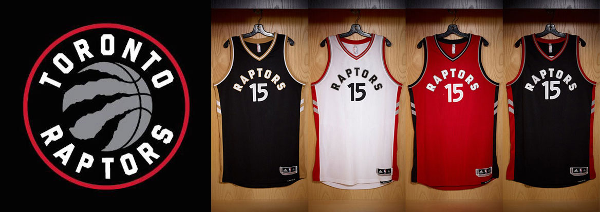
The Raptors have needed a new image for years. Until this year, they’d barely made any adjustments to the
goofy logo they’ve had since coming into league. They scrapped the cartoon dinosaur for cleaner lines and less clutter, making their aesthetic feel more mature. Like the Bucks, they’ve gone with a hard-edged typeface that is more serious. Toronto’s new look says they want to be recognized as a legitimate contender who is taken seriously. The only problem is that they might have gotten too serious. A lot of the Raptors’ charm has been removed, and what’s left behind doesn’t distinguish itself much from the other 29 teams in the NBA. Still, it’s a definite improvement from their previous design.
The Worst:
Los Angeles Clippers
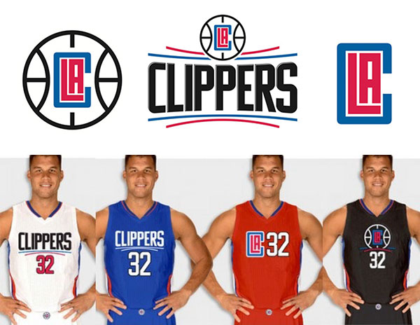
Everything about the Clippers’ rebrand feels like a rush job. Current owner Steve Ballmer probably wanted to distance himself as much as possible from former ownership that he sped up the design process to meet the deadline for the 2015-2016 season. If that’s the case, patience might have yielded better results. The Clippers’ rebrand is on the opposite side of the spectrum from the Bucks’. Where the Bucks’ feels thoughtful, this feels rushed. Whatever details exist in the Clippers’ look are unnoticeable and don’t exude the same appreciation for the city as the Bucks’. Props to the Clippers for making a
hilarious Funny or Die video about the logo design, but that doesn’t change the fact that it fails to impress. Luckily, the Clippers are easily one of the best teams in the league with one of the most passionate owners in sports. It’s just a shame that their look and feel won’t reflect the quality play that’s on the court.