Design Dictionary: Creative Terms Explained
I’m in the middle of an important meeting, with a room full of eyes looking at me as if I’ve lectured about quantum physics. Glazed over stares trying to hide that they have no idea what I just said, nodding along in agreement. I can tell by everyone’s faces that I’ve drifted a little too far into the design lexicon, leaving them in a trail of tracking, kerning and leading. I retrace my steps and dive back in, this time speaking in terms that normal people will understand. The confused looks melt away and genuine smiles reappear on their faces.
I tend to get caught up in the moment and forget that my audience might not be familiar with all the design jargon I commonly use. I’ve compiled the list below in an effort to make anyone working with a designer feel more confident when discussing the creative process. This list is made up of terms that I use often and frequently have to explain.
Anti-aliasing – A technique used to add greater realism to a digital image by smoothing jagged edges on curved lines and diagonals.
 CMYK vs. RGB
 – CMYK, which stands for cyan, magenta, yellow and black, is a subtractive color model used in color printing. CMYK refers to the four colors of ink used in some color printing. RGB, which stands for red, green and blue, is an additive color model used on screens in which red, green, and blue light are added together in various ways to reproduce a full spectrum of color.
 DPI
DPI – Dots per inch. Printed materials usually default to 300 DPI, while images on screen are typically 72 PPI (pixels per inch).
FPS – Frames per second. Used for measuring the frame rate of a moving image. Standard frame rates are 30 and 24, for video and film respectively.
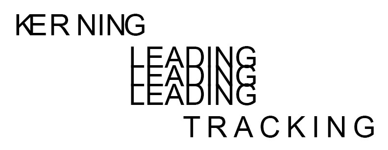
Kerning, Leading and Tracking – Kerning refers to the spacing between characters in words. Leading determines the vertical spacing between lines of text. Tracking is like kerning, but refers to the adjustment of spacing throughout an entire word, as opposed to only certain characters.
 Process vs. Spot Color
 – Process refers to printing using CMYK colors, also known as 4-color. Spot or solid color refers to printing using individual manufactured inks, like those created by
Pantone. Spot colors often look cleaner and brighter than their process equivalents.
Raster vs. Vector – A raster image is made up of a number of tiny squares of color information, or pixels. Raster images can’t be upsized without negatively impacting quality. Vector images use math to draw shapes using points, lines and curves. Vector images can be resized without affecting quality, but they can’t contain as much detail as a raster graphic.
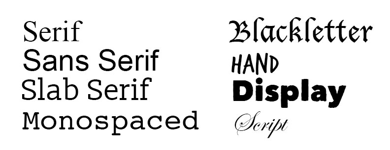
Typefaces – The image below shows different styles of typefaces: