Designing the Logo for GFM’s Sister Agency, CenterTable
When we decided to form GroundFloor Media’s sister agency, CenterTable, a design challenge arose in the form of a new identity. Unlike logos for most new businesses, CenterTable’s had to show a connection to an established brand. CenterTable had to look new and unique, while also calling to mind its relationship with GroundFloor Media. As soon as we figured out the name for our new venture, I began sketching out dozens of ideas. Below, I’ll summarize the process of breathing life into CenterTable’s identity.
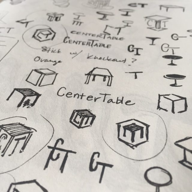
Step 1: Initial Sketches
Knowing the logo had to incorporate some elements of GFM’s design, I chose to focus on shape. With a shared hexagonal silhouette, the logos look cohesive when placed side-by-side.
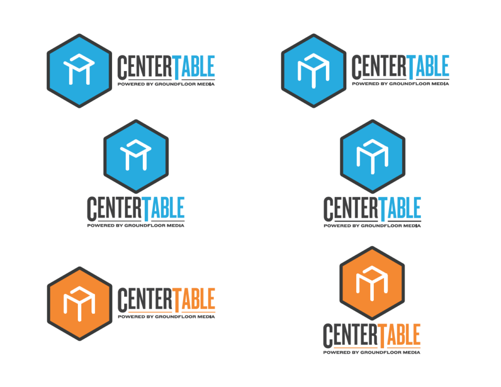
 Step 2: First Drafts
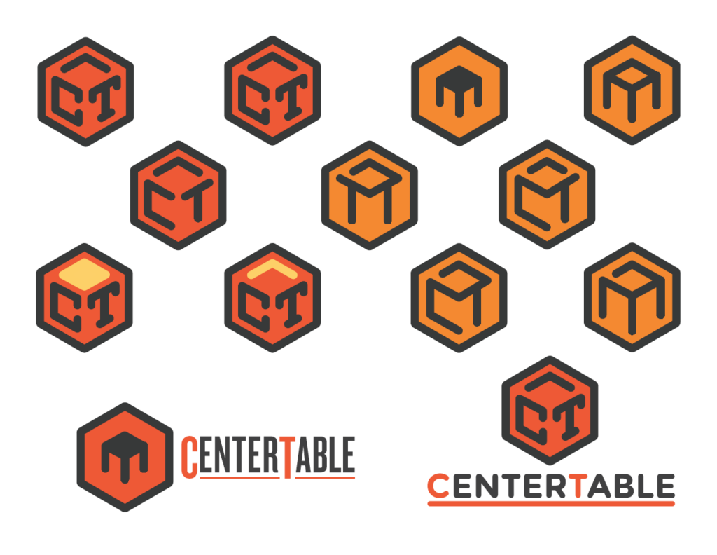
After picking out a few different concepts, I cleaned them up in Adobe Illustrator. I also experimented with typefaces and color combinations to give a wide range of options.
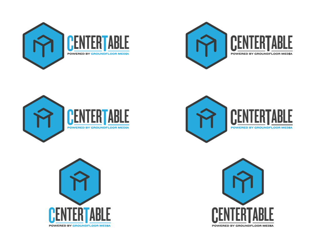
 Step 3: Refinement
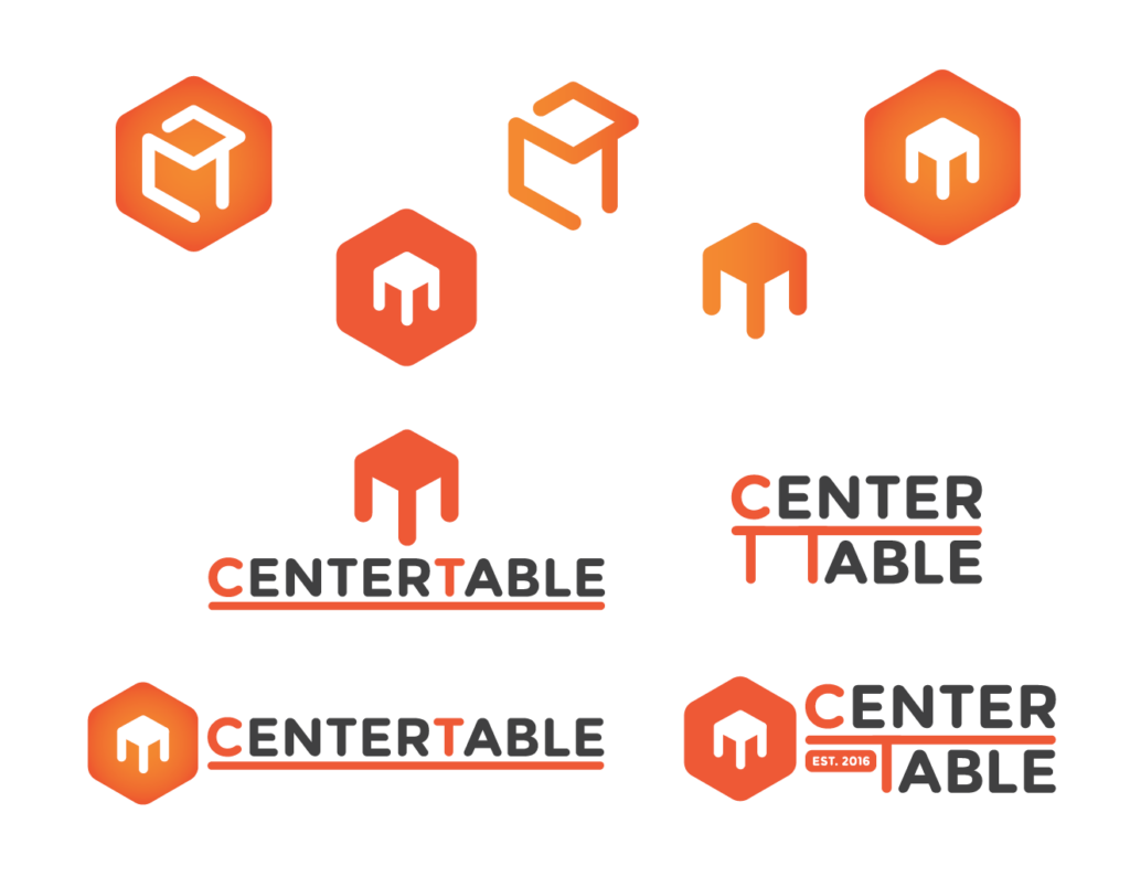
The team narrowed down the options to a few favorites, and I began refining the concepts. To establish a stronger connection with GFM, I incorporated an identical type treatment. I also used an electric blue to contrast GFM and help solidify that the company is in the digital space. With the name “CenterTable,” many of us felt that using earth tones in the logo made it easily confused with a kitchen goods store or a restaurant. The electric blue and uniform lines help distinguish CenterTable as a digital brand.
 Step 4: Final Logo
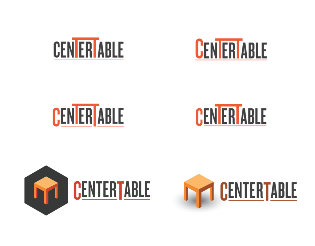
With a few more tweaks, CenterTable got its logo.