
-
Communications
- Earned Media
- Advocacy & Issues Management
- Thought Leadership
- Change Management & Employee Engagement
- Training
- Interim Communications & Marketing Support
-
Creative Services
- Graphic Design
- Brand Identity
- Data Visualization & Infographics
- Creative Campaign Management
- Video Production
- Website Design & Development
-
Crisis & Issues Management
- Online War Room®
- Crisis Preparedness
- Crisis Response
- Reputation Repair
- On-Demand Crisis Consulting
- Media Coaching
- Digital Monitoring & Engagement
-
Marketing
- Paid Media
- Social Media Marketing
- Search Marketing
- Influencer Marketing
- Email Marketing
- Interim Communications and Marketing Support
- Multicultural Marketing


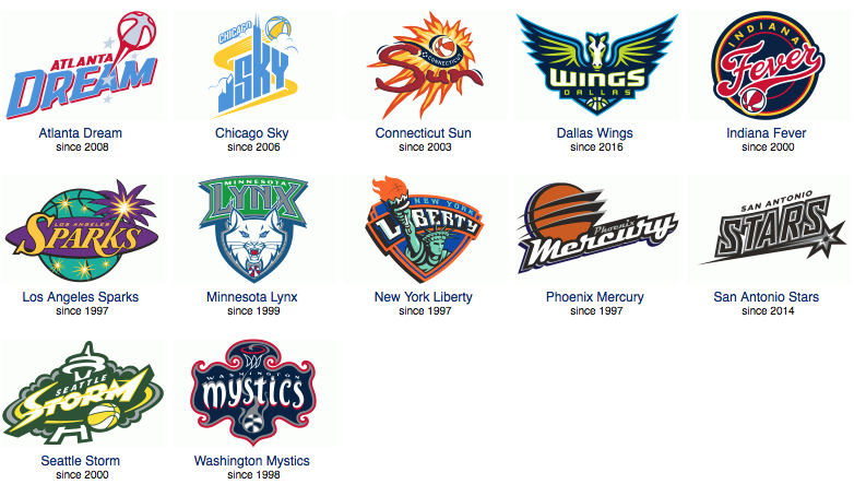
WNBA Teams Deserve Better Names and Logos
For me, watching the U.S. Women’s National Basketball Team destroy the competition was a highlight of the Rio Olympics, especially in comparison to their more highly touted male counterparts who occasionally struggled to squeak out wins. The women straight up dominated on their way to winning gold (for the sixth straight time), outscoring their opponents by an average of 37 points. Their superiority made me wonder: why does the WNBA settle for such terrible names and logos for their teams? These women are athletes and competitors. They deserve better than to play for the Sparks, Sky, Fever and Dream. The especially irksome names are all derived from NBA affiliates, with the women’s team being the lesser of the two. The Wizards (an awful name in its own right) have the Mystics, the Timberwolves have the Lynx, the Spurs have the Stars, and the Mavericks have the Wings. Let’s give these women the respect they deserve and come up with some team names that are cool, and logos that aren’t simply bastardizations of their NBA brothers.
2016 WNBA Logos from sportslogos.net
Rather than trying to fix one of the current WNBA team identities, I decided to start fresh with a possible expansion team in Denver. While I highly doubt the WNBA will expand here any time soon, largely because the Nuggets often struggle to sell tickets, for the purposes of this exercise we’ll pretend the WNBA is rolling into town.
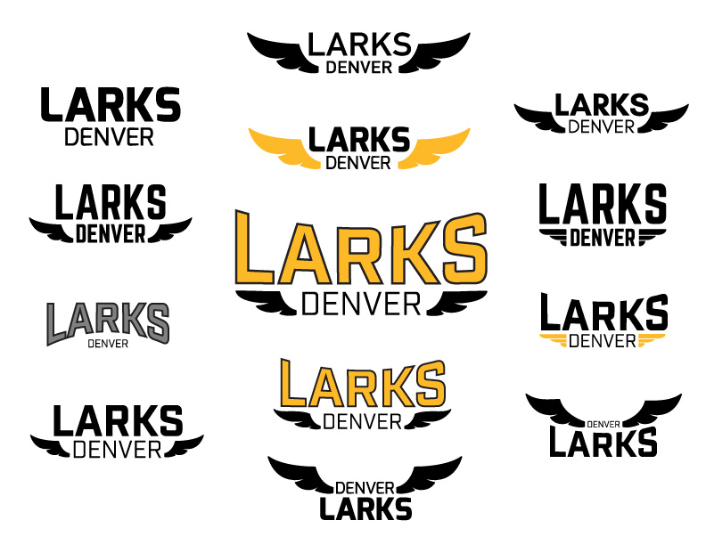
First things first: we need a name! Now your standard WNBA executive would most likely go for something kitschy and demeaning that links directly back to the nearest NBA franchise. My best guess is that Nuggettes would get thrown around quite a bit. They might even consider something like the Denver Gold. Screw that. In my opinion, the best team names have something to do with the team’s location. They’re a shoutout to where the fans live. Every Denver team has a name that supports this. Broncos, Avalanche, Rockies, Nuggets, Rapids, Outlaws, and even Mammoth all call to mind elements of Colorado’s history or geography.
Here’s my WNBA idea: the team in Denver should be called the Denver Larks. At first glance it sounds as lame as any other WNBA name, but bear with me. The lark bunting is Colorado’s state bird, plus, when Denver scraped together its first ABA team in 1967, it was founded as the Denver Larks before changing to the Denver Rockets at the start of the season. The name calls out our state bird AND local basketball history. That’s badass.
With a name selected, we need a logo. Again, your average WNBA executive would default to a reinterpretation of the closest NBA team’s logo. Luckily, since our name has nothing to do with Nuggets, we get to do whatever we want. Below you can see how I went from sketch to final:
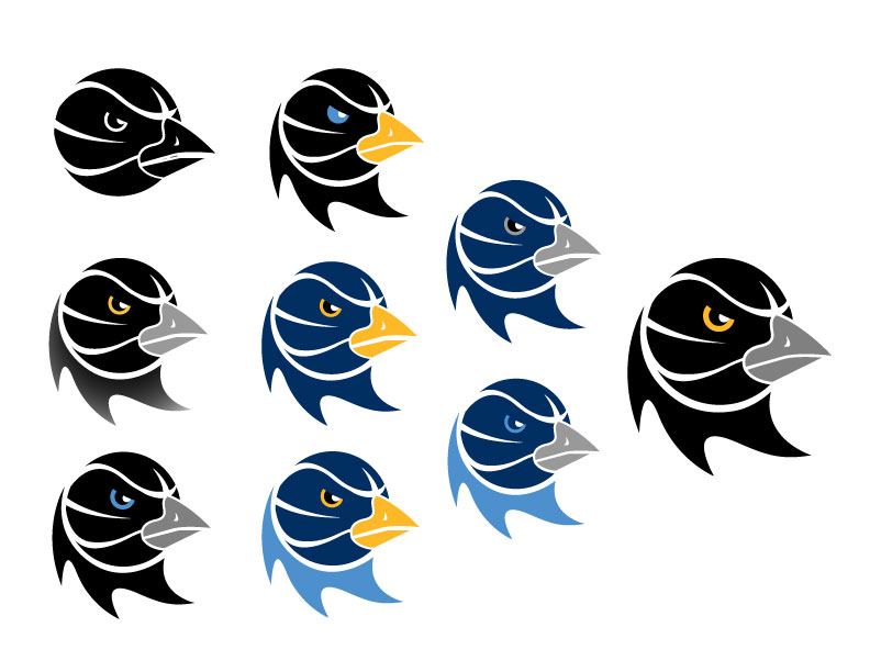
My design is simple, clean and classic. The typeface offers a retro sports vibe without feeling old. The negative space in the head shows a connection to basketball. The gesture of the logo provides movement and energy. The gold and silver connect the team with Colorado’s mining history. All of these elements create what I feel is a much more effective logo than what is currently seen in the WNBA. Go Larks!